Indigo Pine
REAL ESTATE
Indigo Pine Co is a distinguished real estate company based in Australia, dedicated to providing a selection of high-end apartments in amazing locations. Established on the principles of luxury living and a deep connection to nature.
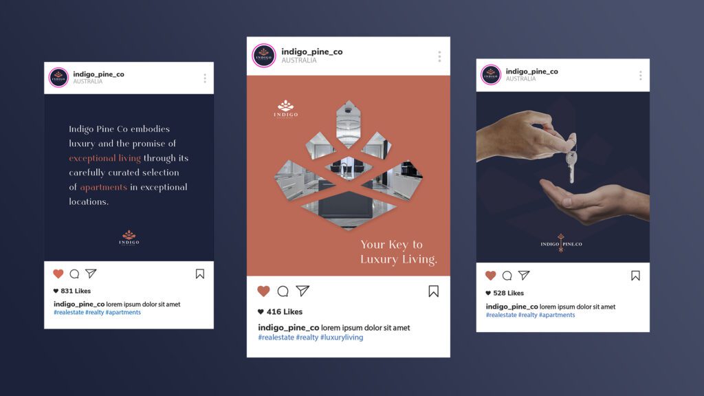
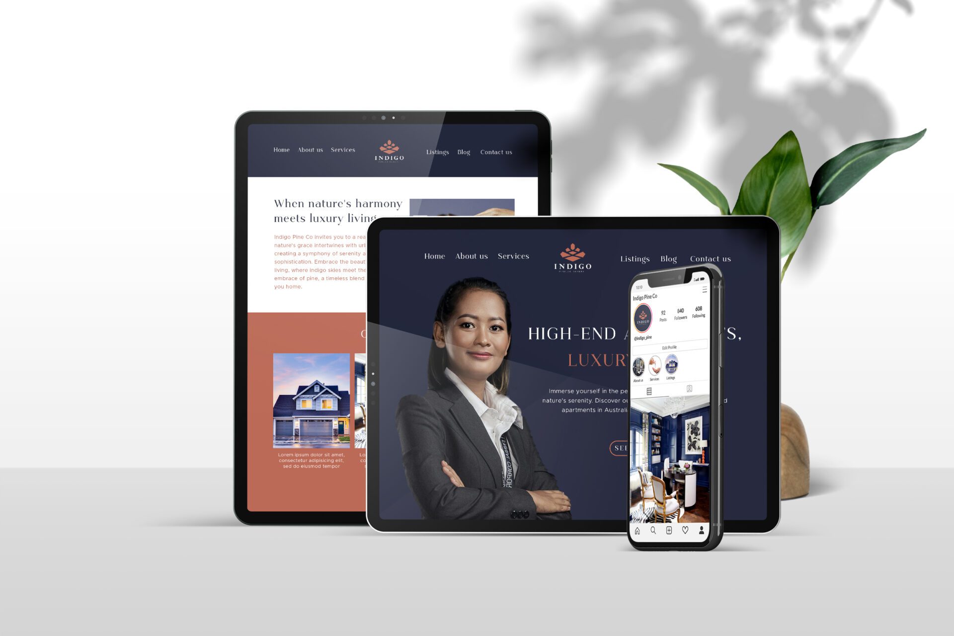
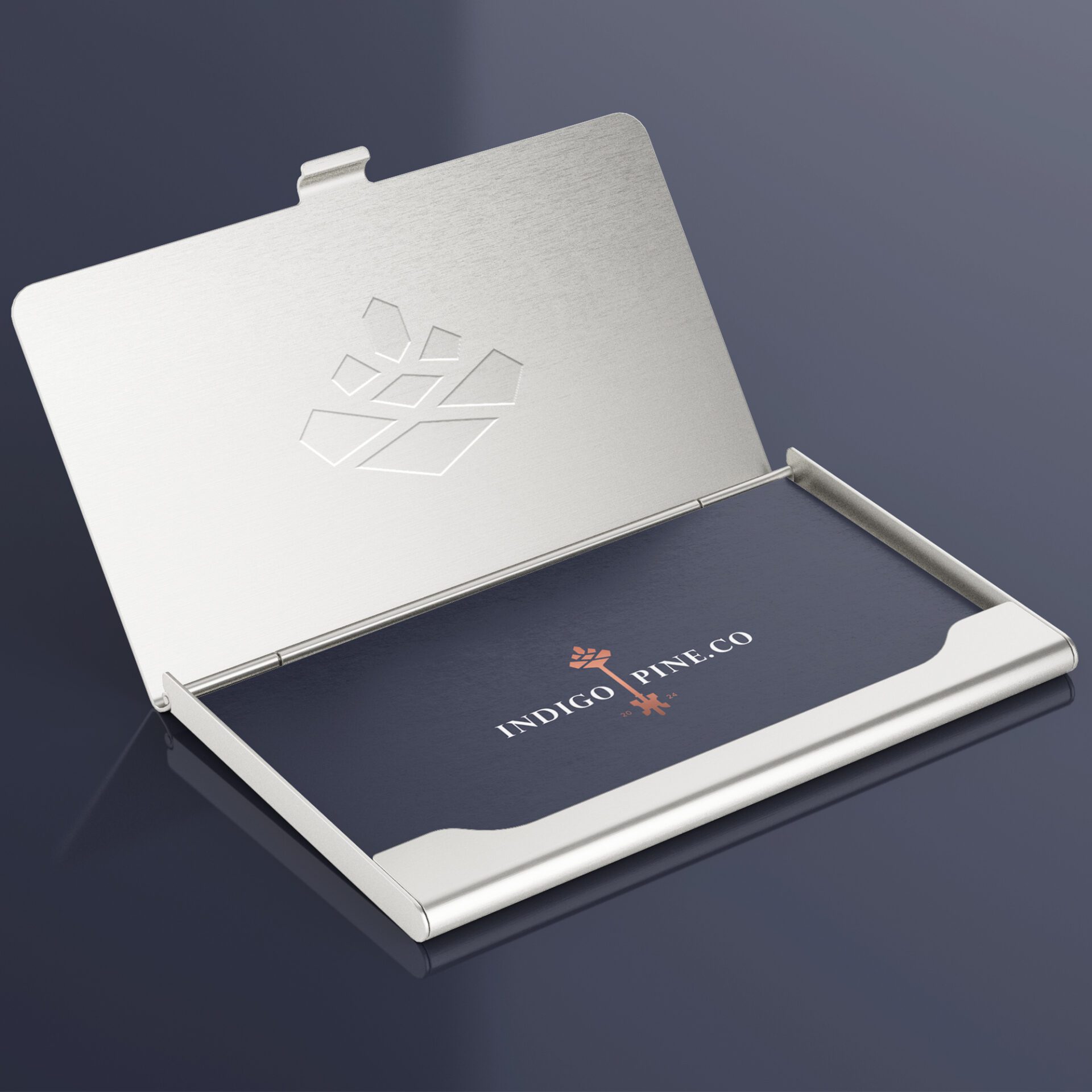
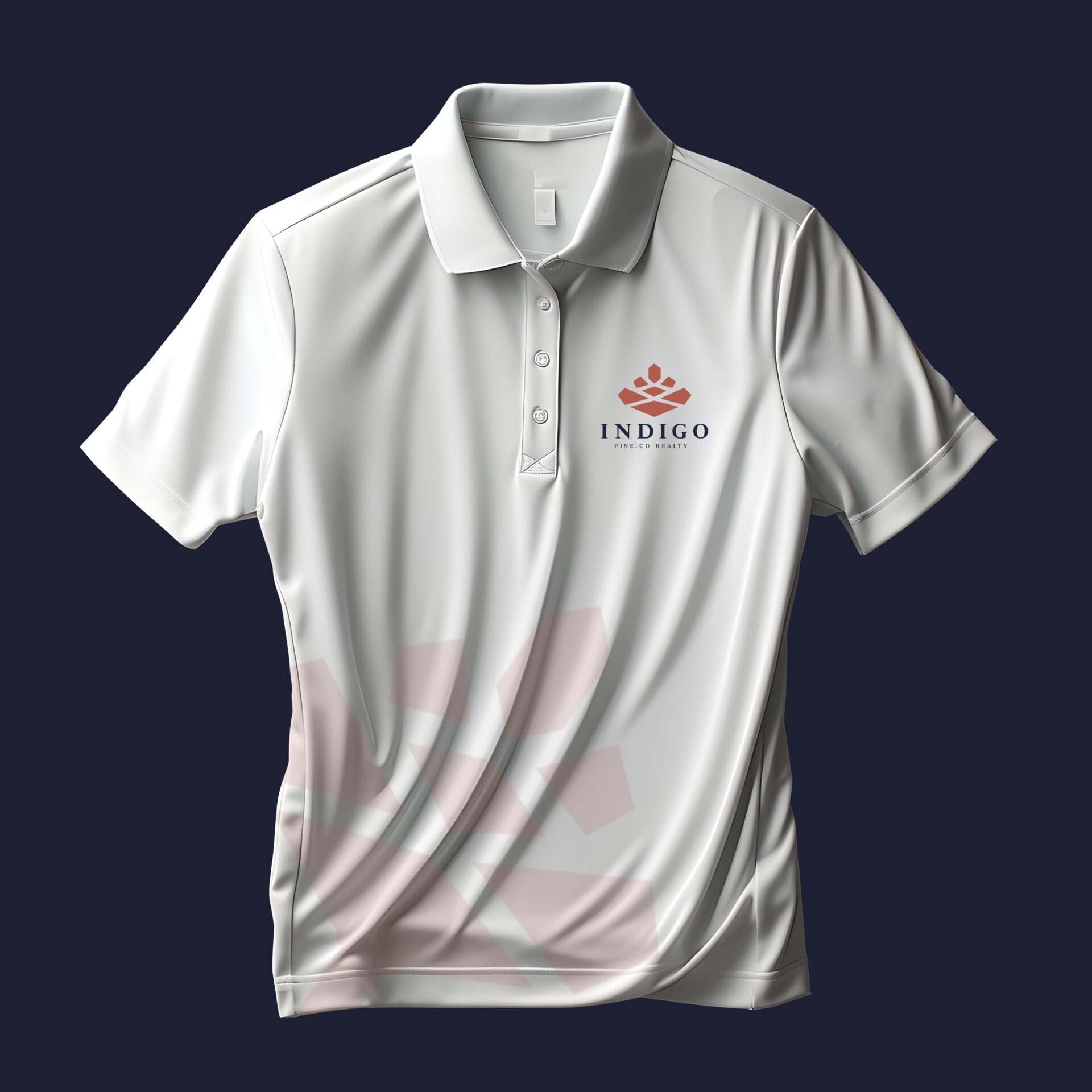
They wanted a complete brand design that will become an epitome of harmonious living spaces that seamlessly blend nature’s beauty with urban luxury. Their preference was a premium combination logo that will be used on their stationery and vehicles and a complete identity to match including a web design.
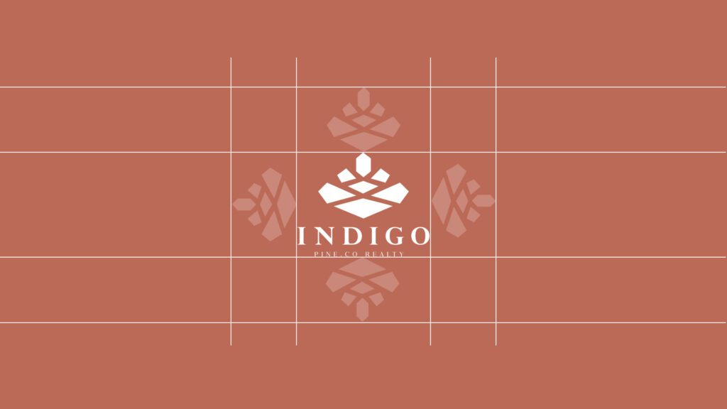
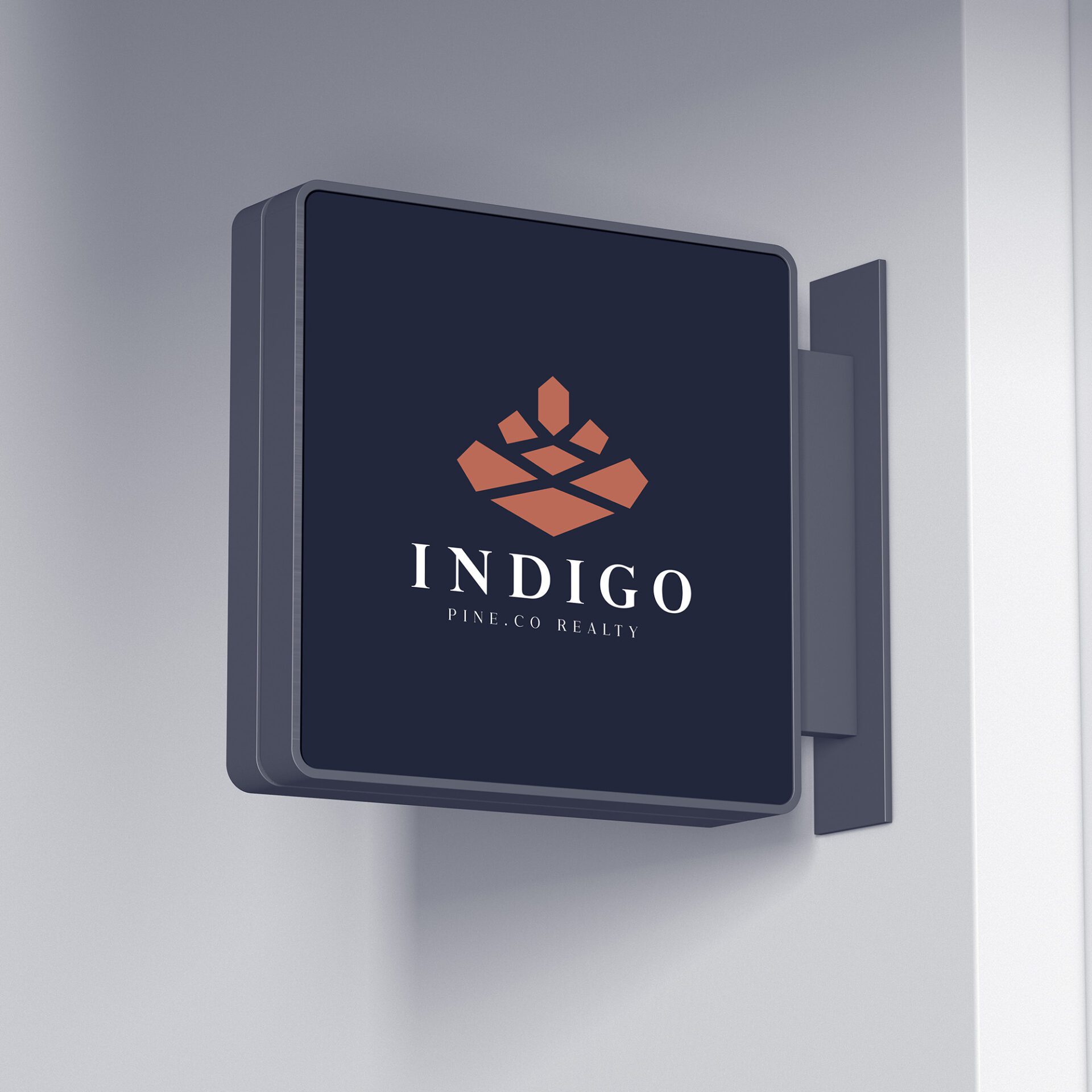
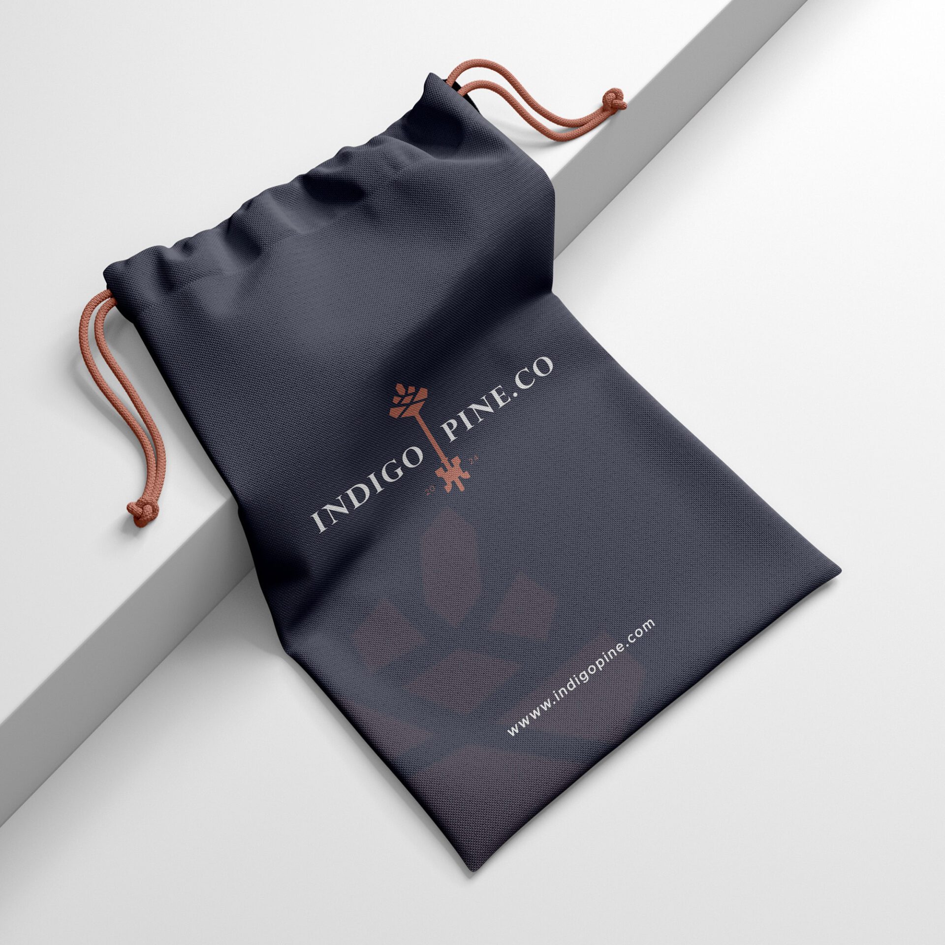
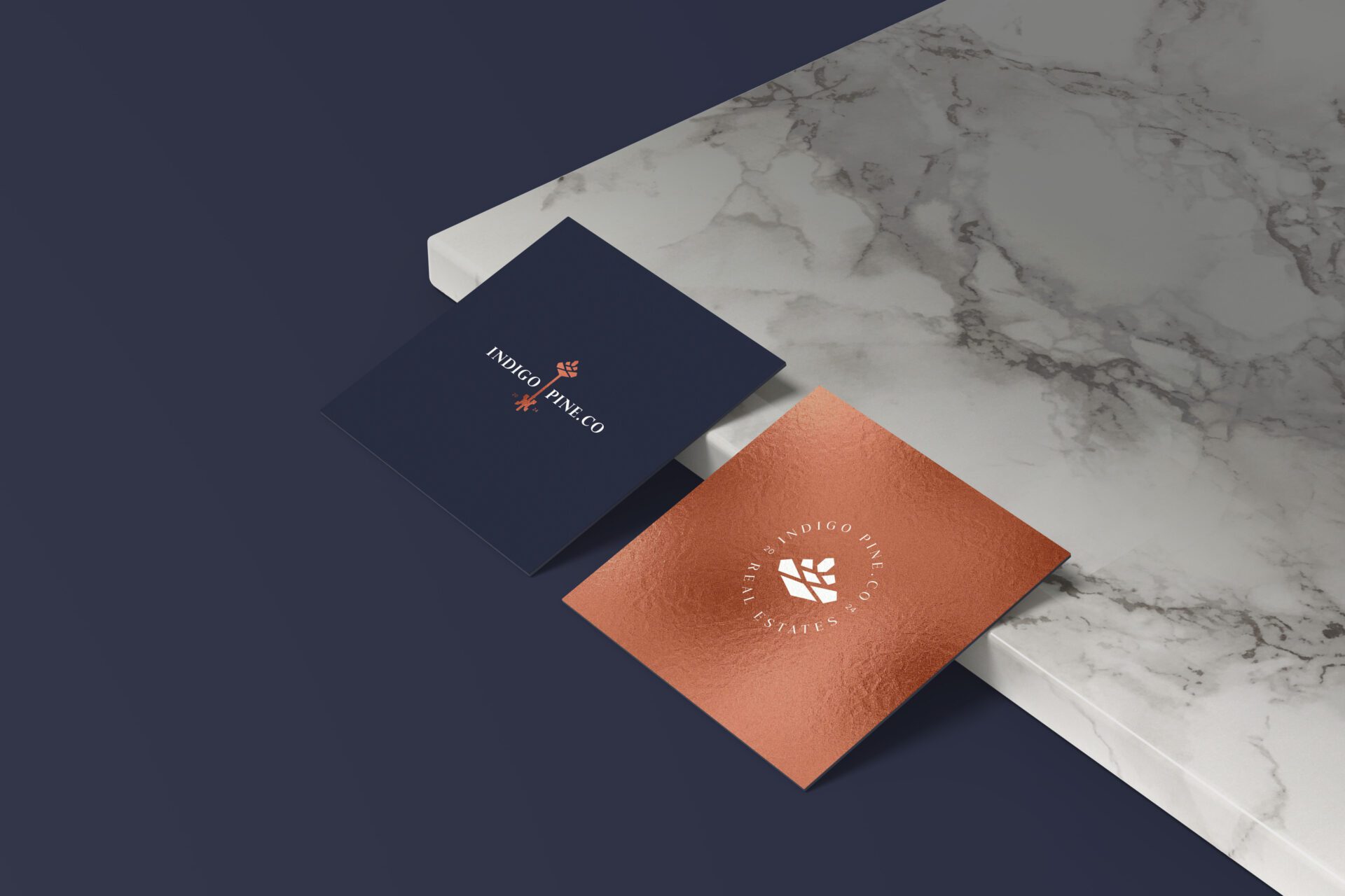
We came up with a sophisticated key creatively crafted by combining the top part of a pine cone with the bottom part of a classic key, creating a harmonious fusion of nature and real estate as the brandmark. The design is a premium horizontal lockup with the text “Indigo” elegantly placed on the left side of the key and “Pine Co” on the right side.
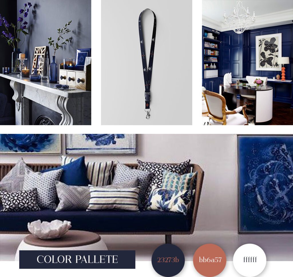
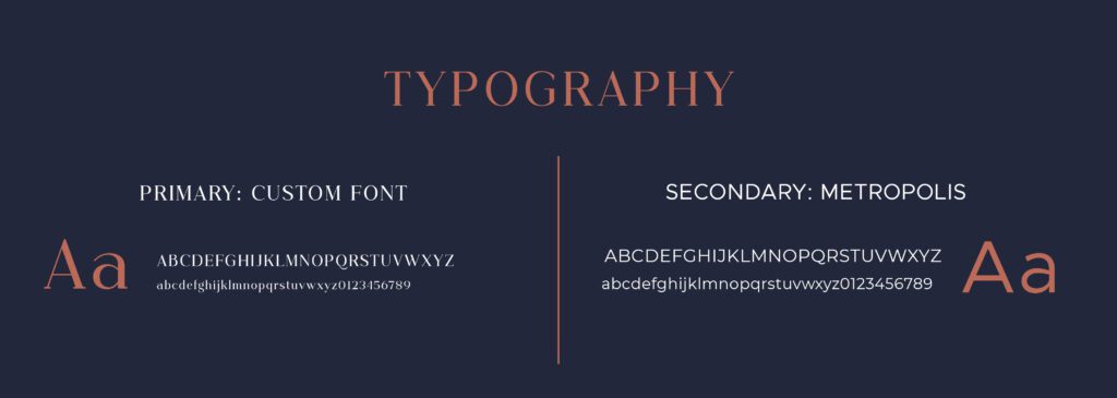
It uses high-end serif font types that exceptionally exude sophistication and complement the overall minimalist design. The color palette is carefully chosen to evoke a sense of luxury, professionalism, and prestige. The primary color is a rich Indigo Blue, symbolizing trust, stability, and integrity. The secondary color is bronze, adding a touch of warmth, luxury and timelessness to the design.
The overall brand identity is characterized by clean, minimalistic approach and a perfect balance between the natural and man-made elements. We wanted it to radiate elegance and reflect the premium offerings of Indigo Pine Co in the real estate market.
CLIENT: INDIGO PINE CO
PROJECT: VISUAL IDENTITY AND WEB DESIGN
YEAR: 2024