I’ve seen countless businesses overlook one of their most critical assets: the logo. Often dismissed as a mere visual element.
However, beneath the surface, a logo is much more than just a visual identifier. It is the first point of contact between a business and its audience, one of the important elements of your brand that can make or break your company’s success.
While investing in a professionally designed logo may seem like a significant expense, the cost of a bad logo design can be even more substantial in the long run.
In this blog post, I’m going to uncover the hidden, yet substantial costs associated with a poorly designed logo. Let’s dive right in…
The Initial Cost.
Many businesses fall into the trap of minimizing expenses by opting for a cheap or hastily designed logo. Yes it may seem like a smart financial move at first, saving you a few bucks.
However, the true cost emerges gradually, casting a dark shadow over the company’s growth.
Investing in a professionally designed logo might seem like a hefty expense initially, but it’s an investment that pays dividends in the long run.
A well-crafted logo becomes the face of your brand, symbolizing its values, vision, and the visual cue that triggers recognition.
It communicates professionalism and establishes credibility, laying the foundation for customer trust.
Conversely, a poorly designed logo fails to resonate with your audience. It can create confusion, scepticism, or even push potential customers away.
This initial cost-cutting measure often leads to increased expenses later while attempting to rectify the damage caused by a lackluster logo.
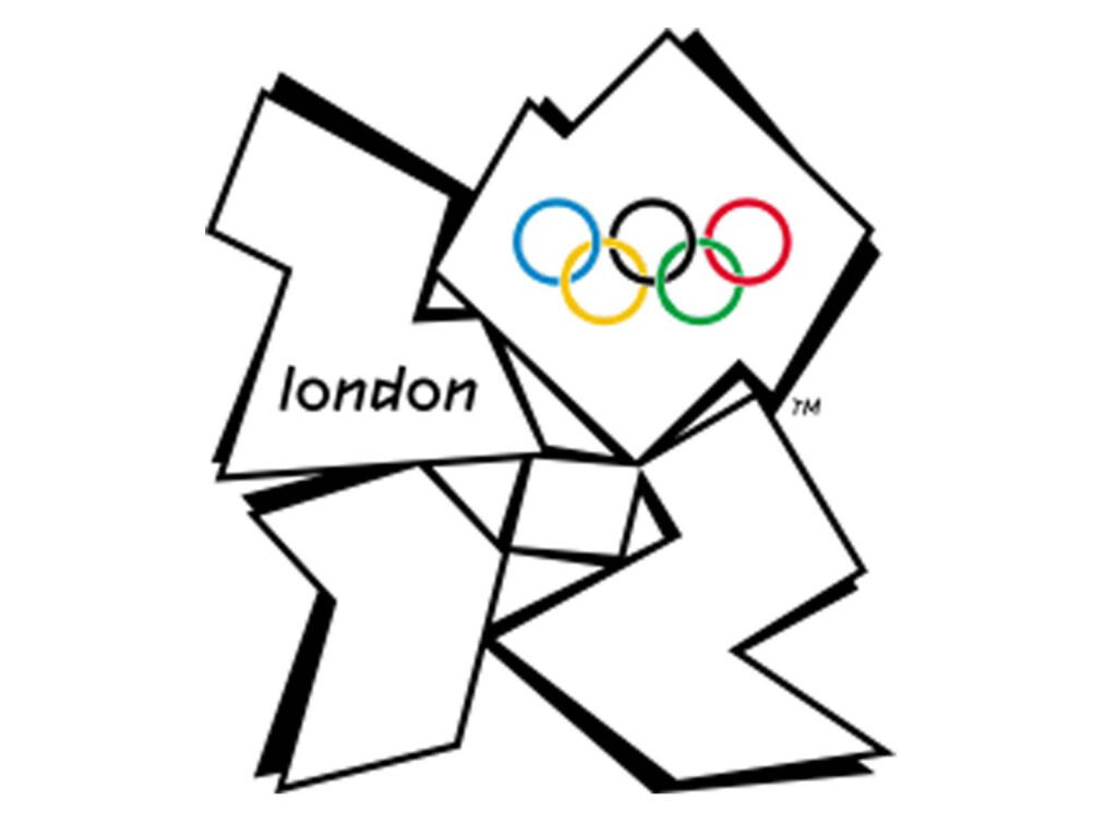
Consider the infamous case of the London 2012 Olympics logo. The initial unveiling of this emblem stirred controversy and divided opinions worldwide.
While some appreciated its avant-garde design, many found it perplexing and disconnected from the event’s spirit.
The cost to create this logo was staggering, reaching around £400,000. However, the controversy it sparked resulted in immense damage control expenses.
Countless redesigns, marketing campaigns to shift public perception, and attempts to mitigate negative reactions led to additional costs, ballooning the overall expenditure far beyond the initial design price tag.
The London 2012 logo serves as a poignant example of how a substantial initial investment in a logo design doesn’t necessarily guarantee success.
If the logo fails to resonate with its intended audience, it can lead to significant financial repercussions, ultimately outweighing the upfront savings.
Missed Opportunities.
It is no hidden fact that: “first impressions matter”. A well-designed logo has the power to captivate, resonate with its audience and become an emblem of trust and reliability. Nike logo doesn’t need any introduction in this regard.
A bad logo on the other hand, fails to make a positive impact, hindering your ability to connect with potential customers.
It weakens the initial interaction and reduces the likelihood of converting prospects into loyal patrons.
The missed opportunity I’m talking about here is not merely a lost sale but the untapped potential, the diminished brand recognition, and the lost chance to forge strong, lasting connections with your audience.
The case of Gap’s logo redesign debacle serves as a poignant lesson in missed opportunities. In 2010, Gap attempted to refresh its brand image with a new logo, deviating from its iconic blue box.
The redesign was met with an overwhelmingly negative response from customers and design enthusiasts alike.
The proposed logo, a simple Helvetica typeface with a small blue box above the “p,” lacked the distinctive charm that had made the original logo iconic.
Customers were vocal about their discontent, expressing nostalgia for the classic logo that had become synonymous with the brand.
The missed opportunity here is, the new logo failed to resonate with the brand’s loyal customer base. Gap had underestimated the emotional connection people had formed with the original logo over the years.
This misstep resulted in a loss of brand loyalty, with customers feeling disconnected from the brand they once cherished.
The Gap logo redesign serves as a testament to the significant impact a logo can have on brand perception and customer loyalty.
It highlights the importance of understanding and respecting the emotional connection consumers have with a brand’s visual identity.
Rebranding Costs.
Rebranding stands as a potential solution when a company realizes its logo isn’t resonating with its audience or aligning with its evolving identity.
However, the process of revamping a logo and associated branding materials incurs substantial costs.
They include: allocating resources for logo redesign, new marketing materials, updated signage, packaging, and digital assets can accumulate into a considerable expense.
These costs are often underestimated and can strain a company’s budget.
In an attempt to modernize and reposition itself in the market, RadioShack made a bold move in 2009 by rebranding itself as “The Shack.”
The company hoped to shed its outdated image and appeal to a younger, tech-savvy demographic. However, this rebranding endeavor came with unforeseen expenses and consequences.
The process of rebranding involved much more than a simple change of name. RadioShack had to invest in altering signage, updating marketing collateral, revamping stores, and rebranding its digital presence.
The costs of this transformation was reported to be around $200 million, consuming valuable financial resources at a time when the company was already facing challenges.
Despite the significant financial investment, the rebranding failed to achieve the desired results. Customers remained unconvinced by the name change, and the attempt to appeal to a younger audience fell flat.
Eventually, RadioShack filed for bankruptcy in 2015 despite the company’s attempts to revert back to using “RadioShack”, highlighting the financial setback and the missed opportunity to revive the brand’s relev
You see, there are intangible costs that often go unnoticed when rebranding. These include the potential loss of brand equity built over the years, confusion among existing customers, and the challenge of regaining lost trust.
Brand Reputation.
Your brand’s reputation is like a delicate ecosystem shaped by various elements, with the logo reigning as a centerpiece.
A well-designed logo speaks volumes about your brand’s values, reliability, and professionalism, fostering a positive perception among consumers.
Conversely, a poorly executed logo can cast a dark shadow over your brand’s reputation. It becomes the bad talk of your business and plants a seed of doubt about the quality and credibility of the products or services you offer.
PepsiCo’s Tropicana underwent a significant rebranding effort in 2009, unveiling a new logo and packaging design.
The aim was to rejuvenate the brand and align it with modern consumer preferences. However, this overhaul resulted in a massive backlash from loyal customers.
The new logo and packaging stripped away the familiar imagery consumers had grown accustomed to.
The removal of the iconic orange with a straw in favor of a more generic design left consumers feeling disconnected from a brand they had come to recognize and trust.
The abrupt change caused confusion and dismay among Tropicana’s customer base.
The consequences were substantial as sales plummeted drastically, witnessing a loss of nearly 20% in just two months.
Consumers took to social media platforms, expressing their disappointment and confusion, leading to a barrage of negative feedback.
This underscores the profound impact a logo, often underestimated, can wield over a brand’s hard-earned reputation.
The Tropicana incident serves as a stark reminder of the delicate balance between refreshing a brand’s image and preserving the heritage that resonates with a brand’s audience.
Loss of employee morale.
While the impact of a bad logo is often measured in terms of external perception, its effects also bleeds internally affecting the heart of any organization- the employees.
A logo that fails to reflect the company’s vision can create a sense of disconnect among employees. It diminishes their sense of belonging and pride in their workplace.
In 2013, Yahoo unveiled a new logo after a month-long campaign teasing the change. The new logo aimed to reflect the company’s modernization and convey a sense of innovation.
However, the reception, particularly internally, was mixed. The month-long buildup created high expectations among employees with an anticipation for a groundbreaking change.
However, the final reveal- a subtle, incremental modification to the existing logo left many feeling underwhelmed.
Employees who anticipated a bold and radical rebranding were disappointed by the lack of substantial change.
This disappointment within the ranks impacted morale. Employees who were expecting a fresh and inspiring logo felt let down and disillusioned.
Investing in a logo that employees can rally behind is crucial in fostering a positive work culture. It becomes a symbol not just for customers but for the internal team, strengthening their sense of unity, purpose, and commitment.
In Conclusion,
A logo is the silent ambassador of your brand, wielding influence far beyond aesthetics. Investing in a well-crafted logo isn’t just an expense, it’s an investment that will serve your brand in the long run.
Businesses must recognize the pivotal role a logo plays in shaping perceptions, forging connections, and establishing credibility.
The hidden costs of a bad logo extend beyond initial design expenses. They manifest as missed opportunities, tarnished brand reputation, and the arduous journey of rebranding to rectify the damage caused.
It’s a good practice to remember that a good logo isn’t just about what looks visually appealing but what resonates authentically with your audience. It’s the embodiment of your brand’s values, aspirations, and promise.
What are your thoughts on the impact of a bad logo on brand success? Have you encountered a logo that significantly influenced your perception of a brand?
Share your insights and experiences in the comments below!